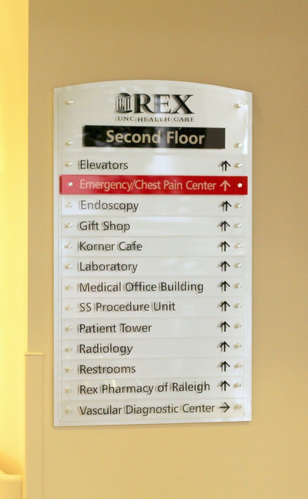
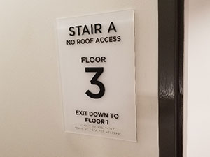
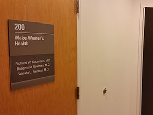
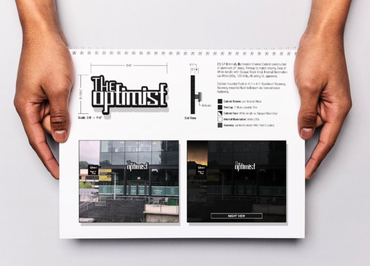
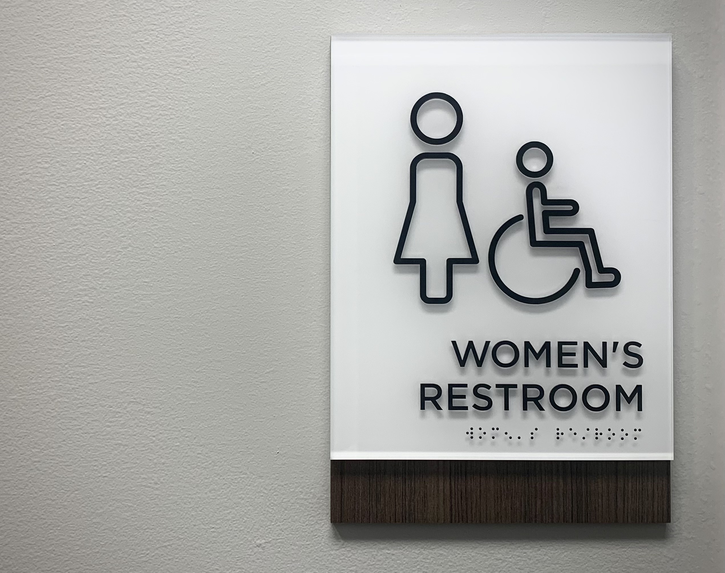
Not only do signs for your business need to be eye catching and informative, but they must also be ADA compliant. You may not know this, but the American with Disabilities Act, ADA, requires that places of public accommodation, commercial facilities, and state and local government facilities meet very specific signage guidelines.
We’ve created a quick guide featuring the most up-to-date ADA regulations for interior signage so you can help ensure your business is fully compliant.
Size and Space Requirements
All elements on your sign, as well as the sign itself, must meet specific size and styling guidelines, including:
-
- ADA requirements specify a size range for text height of 5/8 – 2 inches. The most common size for text is ⅝ inches, and you need to allow 2 inches of height per line of text.
- For text that is larger, you must allow for 2 times the height of the characters, plus 1 inch per line of Braille.
- Pictograms must be 6 inches high.
- Text must be in simple, sans serif font, in a medium or bold weight. A tactile sign must be in UPPERCASE. Italics, scripts, and other hard-to-read fonts are not allowed.
- Visual only sings, such as overhead signs, may be in lowercase.
Braille
Signage must be tactile for the the visually impaired, with specific guidelines including:
-
- Tactile signs must be Grade 2 with contractions.
- All Braille should be lowercase, except for Proper Names.
- The shape of Braille characters must always be rounded.
- Signs will need to leave a minimum of ⅜ inch clearance on all sides.
Location of Permanent Room ID Signs
Permanent room signs, such as Restrooms and Exits, have guidelines on where they need to be located in relation to doorways:
-
- Permanent room signs are to be located at doorways – this gives the visually impaired a location cue.
- If only one door opens, the sign should mount to the inactive door.
- If the door swings outward, the sign needs to be mounted outside of the arc of the door swing.
- Signs are to be mounted at a height to allow the baselines of raised characters to be located between 48 and 60 inches above the ground.
Visual Characters for Directional, Information, and Regulatory Signs
For the visually impaired, there are certain tactile requirements your signs must comply with that include:
-
- Stroke thickness must be between 10% and 30% of the height of the uppercase “I”.
- Character spacing needs to be between 10% and 35% of the character height.
- Line spacing between the baselines of separate lines of copy should be between 135% and 170% of the maximum character height.
Mounting Heights and Horizontal Viewing Distance Impacts Copy Size
Mounting heights doesn’t usually come to mind when thinking about a sign, however it is very important for the copy displayed. Here are some guidelines regarding mounting and copy size:
-
- Visual copy mounted between 40” and 70” above the floor
- With a horizontal access of 72” or less, copy height can be as small as 5/8”.
- With a horizontal access of greater than 72”, 5/8” copy height will increase 1/8” per foot for each foot over 72”.
- Visual copy mounted between 70” and 120” above the floor
- With a horizontal access of 180” or less. Copy height can be as small as 2”.
- With a horizontal access of greater than 180”. 2” copy height will increase 1/8” per foot for each foot over 180”.
- Visual copy mounted higher than 120” above the floor
- With a horizontal access of 21’-0” or less. Copy height can be as small as 3”.
- With a horizontal access of greater than 21’-0”. 3” copy height will increase 1/8” per foot for each foot over 21’-0”.
- Visual copy mounted between 40” and 70” above the floor
The professionals at Capital Sign Solutions are here to help. We know all of the specifics, so you don’t have to. We can help take care of any signage needs that you may have. Contact us today, we look forward to hearing from you!

